Posts Tagged: usability

Undo is better than Confirm

Consider a Delete button in an application. Click the button and something gets deleted. But what if you click it by accident? Two approaches are commonly recommended:

  • Confirm: Require the user to confirm the action before doing it
  • Undo: Do the action immediately, but allow the user to undo it

The Confirm strategy offers the worst of both worlds. It slows down people who actually want to delete, and it fails to protect those who don’t. In contrast, the Undo strategy offers minimum impediment to purposeful users while making it easy to avoid losing work. Continue reading “Undo is better than Confirm” →

Forms that Work — Jarrett & Gaffney

Forms that WorkForms That Work is a practical book dedicated to making web forms usable and useful. It gathers a heap of information together, with helpful summaries and guidelines to make it easy to create web forms that people will actually use.

Here is a summary of some points that I found particularly helpful. This gives the flavour of the book and serves as a reminder for me at least. For all the background information, you’ll need to read the book itself.
Continue reading “Forms that Work — Jarrett & Gaffney” →

Web Word Wizardry — Rachel McAlpine

Web Word WizardryI read this good short guide to writing for the web a year or two ago. Even though the book is a few years old now, its advice is still relevant: Web technologies change quickly, but the rules for good web writing are the same now as they were when the web was new.

I learned a lot from the sections on writing for international users, specifically for users who aren’t proficient at reading English. Short, active sentences without complicated words. It has helped me respond usefully to comments on this website, which has readers from all over the world.

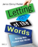
Letting Go of the Words — Ginny Redish

Letting Go of the Words“Writing web content that works” is the subtitle of this book, and it delivers a thorough treatment of the topic. I don’t think it contains any radical new ideas, but it is a nicely organised compilation of what some people call “best practices” about writing and layout for the web.

Of course, you can’t possibly summarise an entire book with a list of bullet points, but here are the ideas in the book that struck me as being especially useful. Continue reading “Letting Go of the Words — Ginny Redish” →

The Design of Everyday Things — Donald Norman

The Design of Everyday ThingsDonald Norman’s excellent book The Design of Everyday Things has some great ideas on design in general. I first read it 20 years ago — I’ve been re-reading it recently and it’s still a fun and relevant read. His wish list in the book includes prescient descriptions of the World Wide Web and the iPhone, amongst other things. But the thing that struck me was some very sensible and solid advice on error handling. It’s good advice whether you’re building a coffee maker or a web application. Continue reading “The Design of Everyday Things — Donald Norman” →

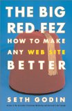
The Big Red Fez — Seth Godin

This book is nice and short, but it could be a lot shorter. It’s supposed to help you “make any website better”. It invites you to imagine that your website visitors are monkeys looking for a banana. If you don’t make the “banana” easy to see and easy to get, they will go to another website instead.

I don’t think that viewing your visitors as monkeys is a good idea. Continue reading “The Big Red Fez — Seth Godin” →

Web Form Design Recommendations

Here is a checklist of recommendations for form design. I extracted this from Luke Wroblewski‘s excellent presentation on Best Practices For Web Form Design; I took my favourite points, edited them, and arranged them into categories for easy reference. I use this checklist when designing and reviewing forms. For best results, view the original presentation and commit it to memory first. Continue reading “Web Form Design Recommendations” →

P is not for telephone

There’s a trend towards indicating contact details by a single letter. You see this on business cards, email signatures and letterheads:

T (01) 234 5678 – F (01) 234 5678 – E bob@boztangle.com

It looks quite nice and clean, especially in a vertical format on a screen as the single letters all line up in nice columns. And it’s pretty obvious what the letters stand for if they stick to the obvious words: telephone, fax, mobile, email. But too often people try to be clever and end up creating confusion. Continue reading “P is not for telephone” →

Lotus Notes is rubbish

The Lotus Notes UI is a disaster. Examples are legion, and there are doubtless a million web pages attesting to this. So here’s the million-and-first. I thought Notes was clunky the first time I encountered it, which was back in 1996. I was dismayed in 2003 when I started a new job to find that I would have to use the Notes client, not just for email, but also for internal documentation and even for entering time sheets. It turned out that that company had started life as a Lotus Notes development shop. I managed to escape, but now my new company and the client that I am working for both use Notes for email. It’s a nightmare. Continue reading “Lotus Notes is rubbish” →

Ajax: How to do it

Ajax and “Web 2.0” have been getting more and more exposure over the last year or so. It may not be quite the revolution it’s cracked up to be, but behind the hype there are useful techniques for building better applications. When people start asking you what you’re doing with Ajax/Web 2.0, you should have a good answer — so here are some thoughts on what you can do about Ajax. Continue reading “Ajax: How to do it” →