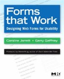
Forms That Work is a practical book dedicated to making web forms usable and useful. It gathers a heap of information together, with helpful summaries and guidelines to make it easy to create web forms that people will actually use.
Here is a summary of some points that I found particularly helpful. This gives the flavour of the book and serves as a reminder for me at least. For all the background information, you’ll need to read the book itself.
Question types
Question in forms may require four types of answer:
- Slot-in – no-brainers like name or phone number
- Gathered – things the user will be have to look up, such as credit card number
- Third party – things the user has to go to a third party for, such as the address of somebody you’re sending a delivery to
- Created – things the user has to think up on the spot, such as a username or a free-text field
Questions may also have the following qualities:
- Anticipated – questions that the user expects, such as credit card number when buying online
- Intrusive – questions that users may not want to answer, such as phone number
Form design guidelines
Ask the “easy” questions first to lead users gently into a form. Easy questions are those that require minimal consideration — they are slot-in, anticipated and non-intrusive.
Make form field labels clear and descriptive. People read labels on forms, but they tend to ignore headings and other text.
Put labels to the left of input fields. If all questions are “easy” then you can right-align form labels. Otherwise left-align. Don’t put labels above fields – this makes it hard to scan labels and fields, and easy to accidentally skip fields.
Keep labels close to fields. Sometimes forms have the labels on the left and the input fields way over on the right. Don’t let your layouts be too liquid.
Lay out form elements with a grid. The grid lines are not visible, but they help to align form elements consistently. It’s disconcerting to see page elements almost lining up. They should either line up perfectly or not at all.
Don’t make your forms too dynamic. It’s disconcerting to have forms field appearing and disappearing all over the place.
Validate user input gently. Say “Please enter the date” rather than “Error: invalid date format”. Display a list of errors at the top of the page, each linked to the actual field (this makes it easy for screen reader users etc.)
When the user has completed the form, display an acknowledgement or thank you message to end on a high note.
Forms that Work is a companion volume to Ginny Redish’s Letting Go of the Words. Read them both, put their ideas into practice, and your users will thank you for it. (Actually they probably won’t. But perhaps they should.)
Delighted that you found our book helpful.
This is a great summary of some of the key points.
Thanks
Caroline
Thanks for writing it!
How does this compare to Web Form Design by Luke Wroblewski? Is it worth buying if you already own that?
“Ask the “easy” questions first”
This part got me about uncomfortable. When I am about to make an order or sign-up for an account I usually want to know what I need to give them to complete the form.
Many times I can see forms where they first ask the simple questions like name. I spend time filling out the first and second pages, then the intrusive questions come.
Now I must choose between answering the intrusive questions or to consider my time on the form so far wasted.
This makes me very cautious whenever I’m presented with a form with only easy questions and a “Next” button.
Of course my way of reasoning might be in minority.
Hi Peter
Although I think that Bennett did a nice job of picking out some of the key points from the book, a quick summary does of course lose some detail.
In the book, we have a whole section on ‘relationship’, which is about being careful to ask only those questions that users expect to answer in the context of why they’re filling out the from.
Putting this another way: You’re right! Most people have exactly the reaction as you describe. That’s why we recommend that forms:
– explain why they’re asking for every question,
– avoid asking invasive questions,
– make the questions easy to answer.
In the past, I’ve also recommended that forms offer an ‘exploration mode’ that would allow users to preview the whole form and check that it doesn’t have any nasty surprises in it. But I’ve never actually seen a form built like this. It would make life so much easier for cautious people like yourself – it’s a pity that designers don’t try it.
best
Caroline Jarrett
http://www.formsthatwork.com
“Exploration mode” is a great idea. One of the benefits of paper forms is that you can see the whole form before you start to answer any of it.
As Caroline says, this page is just a summary of some of the form design guidelines. The book has the full story.