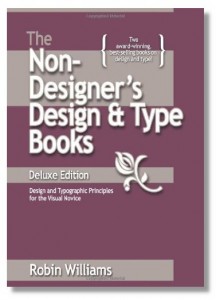
This is a decent overview of graphic design and layout. Everybody who has to design a poster, web page or invitation should read it. And that’s no chore, because it’s an easy and fun read.
This book is an updated compilation of two of Williams’s previous books: The Non-Designer’s Design Book and, unsurprisingly, The Non-Designer’s Type Book. The first half is about design. Williams presents four fundamental layout concepts: Proximity, Alignment, Repetition, Contrast. (I list them in this order because PARC is a better acronym than the reverse.) Most of the rest of this part consists of elaborations and applications of these basics.
The colour section describes shades and tints and talks about warm and cool colours. She also describes the colour wheel. It’s a good intro to a topic that has already filled hundreds of other books.
The layout section in the book mostly refers to print layouts. It contains lots of useful information on page-based layouts, including business stationery, posters and flyers. A lot of this translates well to digital media. There is a section devoted to website layout, but it’s a bit dated.
The section on typography is good. When it comes to fonts, don’t go for concord (too boring) or conflict (too jarring). Instead, strive for contrast to achieve balanced composition. This applies to all layout really, not just type.
There’s a lot more about type in the second half of the book. There’s some useful history and terminology, including a nice distinction between legibility (recognising letterforms) and readability (reading and understanding text). And there’s a lot of specific advice about using specific characters correctly, such as punctuation and spacing. The discussion of the subtleties of letterspacing is quite illuminating.
It makes me sad that one of my favourite typefaces, Helvetica, cops a bit of flak. I have often seen it derided as being dated and “oh so ’70s”. This seems unfair — looking at it now, it just doesn’t strike me as being especially retro. I guess I’m just too young to remember its (over-) use from all those years ago.
Throughout this section of the book, Williams advises us to boldly use contrasting sizes, faces and spacing: in short, Don’t Be A Wimp. This is typical of the good, punchy, memorable advice in this fine book.