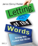
“Writing web content that works” is the subtitle of this book, and it delivers a thorough treatment of the topic. I don’t think it contains any radical new ideas, but it is a nicely organised compilation of what some people call “best practices” about writing and layout for the web.
Of course, you can’t possibly summarise an entire book with a list of bullet points, but here are the ideas in the book that struck me as being especially useful.
- Write information, not documents.
- Don’t make people think. (Thanks, Steve Krug
.)
- Remember that some people will print out pages.
- Cut! Cut! Cut! And cut again! It’s been said for a long time by many writers that people don’t read on the web. The less you write, the more likely you’ll be read.
- Keep active space in your content. Active space is white space that separates content, as opposed to the passive space in page margins and so on.
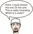
 I have only one quibble with this book. There are a lot of little talking head cartoons, meant to represent web users saying things like, “How do I check my order on your site?” To me, these are so badly drawn that they are intensely annoying: the brunette woman’s lips make her look as if she has a moustache; the man with the cap looks like a bearded woman; the bald man looks like a bald woman with a moustache.
But enough nitpicking. There’s a heap of useful information in this book. Definitely worth keeping and referring to again and again.
Excellent post. I was checking constantly this blog and I’m impressed !