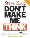
To mark World Usability Day 2009, here’s a review of a classic book on usability for web sites and applications. A lot of the information and advice seems obvious once you’ve read it, but judging by the websites that litter the web, it’s not always obvious when you’re building sites. If all web designers and developers read this book, the web would be a better place. And hey, it’s fun to read. Here are some of the book’s highlights.
Three laws of usability
- Don’t make me think!
- It doesn’t matter how many times I have to click, as long as each click is a mindless, unambiguous choice.
- Get rid of half the words on each page, then get rid of half of what’s left.
Home page design
There’s some good advice about homepage design. Eliminate happy talk. All that text that says “Welcome to our site, blah blah” is just a waste of everybody’s time.
A home page must have:
- A tagline. This is a clear, informative, personable and lively 6-8 word value proposition, conveying differentiation and a clear benefit.
- A welcome blurb. This is a prominent, terse description of the site, using as much space as necessary, but no more.
- Start places: Search, Browse, Highlights.
The home page is the first thing a lot of users will see, so test it to ensure visitors “get” it!
Testing
Do usability testing one morning a month. Test three or four users, then debrief over lunch the same day. After lunch, the team will have decided what to fix. No reports, no meetings.
Focus ruthlessly on the 3-5 most important problems. Do the least you can do to fix each problem: tweak, don’t redesign. Also do trivial 15-minute single-person fixes.
That last tip was taken from an interesting (and short) slide show by Steve Krug called “What I’ve Learned in the 21st Century“. And it contains some bonus advice for all you frequent flyers.
Again, everyone involved in web design and development should read this. So here’s a call to action for you. Don’t think about it: buy this book.